

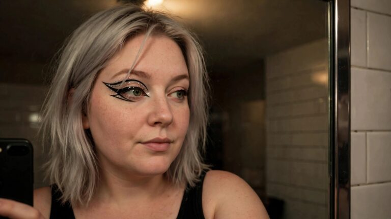
I’ve been noticing how much graphic eyeliner can shift an entire face this year. The clean edges and unexpected shapes feel like an easy way to lean into something bold without committing to full face paint or prosthetics.
Some of the ideas lean sculptural with sharp angles and negative space. Others mix in color blocks or tiny details that catch the light differently depending on the angle. I keep going back to the ones that still read as wearable once the night starts winding down.
It is interesting how much personality a few precise strokes can carry.
Graphic Rhinestone Winged Eyeliner
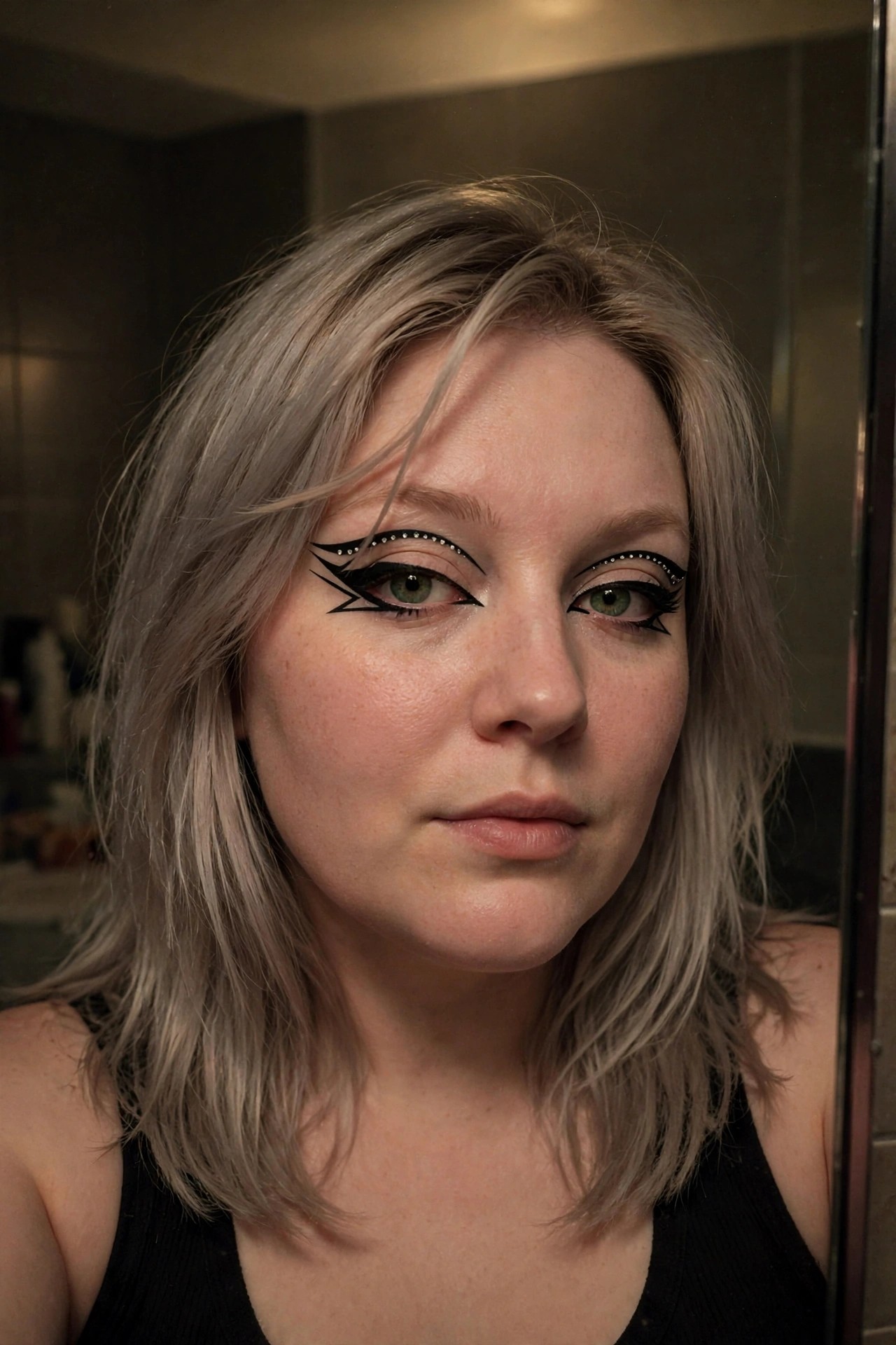
The liner here is the whole story. Sharp black wings stretch out far past the outer corners, then a second line drops down to create that double wing effect. Rhinestones sit right along the upper edge and continue under the lower lash line, catching light without overwhelming the shape. The placement feels precise but still bold enough to read from a distance.
I like how the crystals follow the liner rather than sitting in random clusters. It keeps the look graphic instead of overly decorative. The green eyes underneath stay visible too, which is nice because the design doesn’t bury them. If someone wanted to try this for a party, they could probably map the shape first with a thin pencil, then go over it with liquid liner before adding the stones.
Crescent Moon Graphic Eyeliner
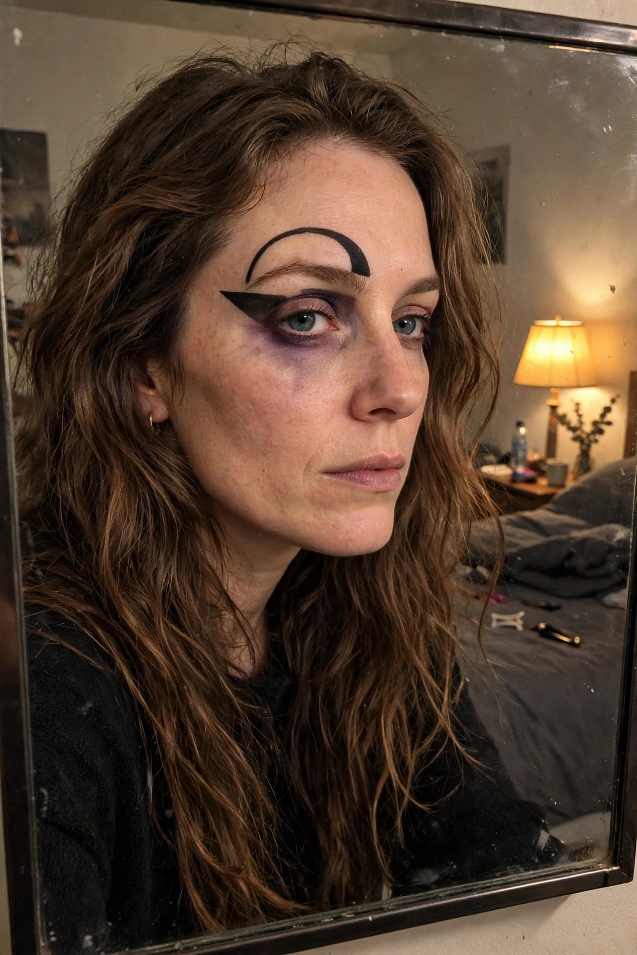
I keep coming back to how this graphic liner turns the whole eye into something unexpected. The thick black wing sits low and sharp while that crescent shape above the brow adds this clean graphic punch. The purple smoky shadow underneath gives it depth without competing with the main design.
It feels bold but still wearable if you have the patience for the lines. The way the moon curve mirrors the wing shape below makes the whole thing feel intentional rather than random. I would probably try this on the other eye too for full symmetry next time.
Stitched Scar Makeup With Graphic Liner
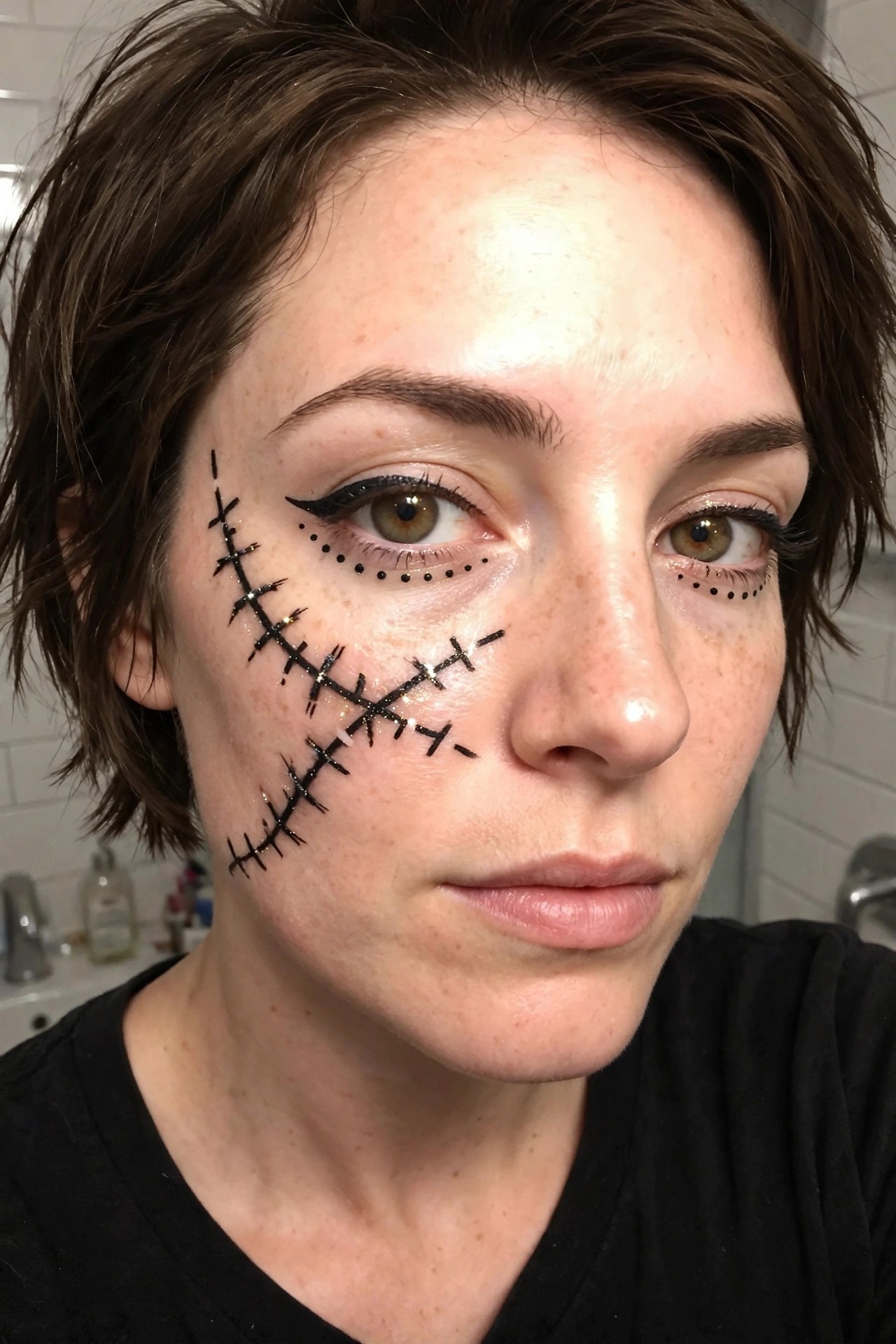
The stitched effect here really stands out because the black lines run in that jagged diagonal across the cheek and up toward the temple. The glitter scattered along the stitches catches the light without overpowering the whole design. What I like is how the stitches stop short of the eye but still connect visually to the liner work underneath.
The dotted liner under both eyes feels like a deliberate extension of the scar motif. It keeps the look graphic and precise rather than just messy face paint. The right eye has a cleaner wing while the left side stays more broken up by the stitches, which creates a nice imbalance that still reads as intentional.
I would probably try this on a night when I want something recognizable but not the usual cat or spiderweb route. The execution looks steady enough that it could work with a basic liquid liner and a steady hand.
Spiderweb Graphic Eyeliner
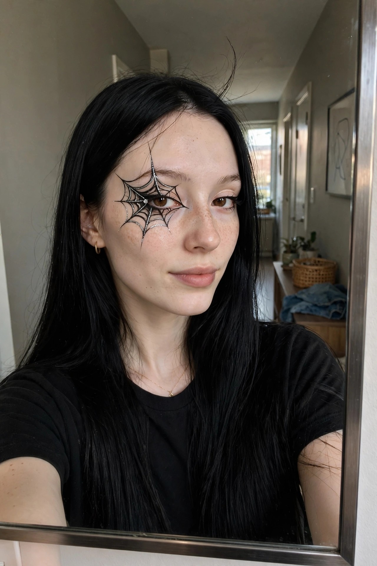
This spiderweb design sits right over the eye and stretches outward in clean lines that still feel delicate. The black base lines are sharp, then silver glitter fills in the threads so the whole thing catches light without looking messy. A single small rhinestone sits near the inner corner and gives the look a little extra shine where most graphic liners stay flat.
I like how the web curves around the lid and drops slightly onto the cheek instead of staying boxed in by the eye shape. It reads as intentional rather than random, and the metallic thread keeps it from feeling too heavy even though the pattern is fairly large. The rest of the face stays simple, which lets the web do all the talking.
Flame Graphic Eyeliner Look
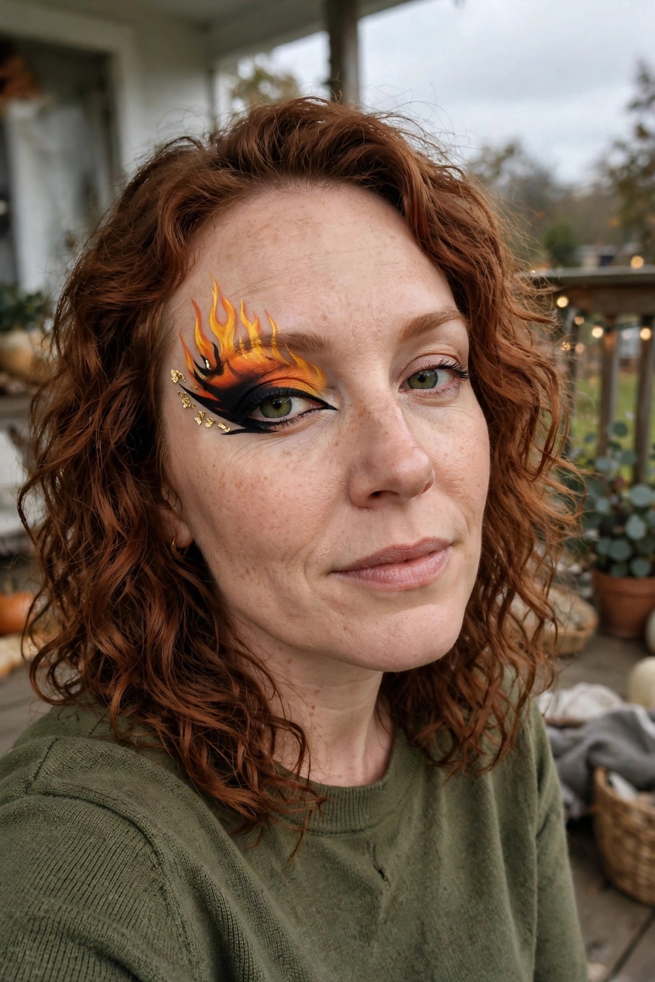
I keep coming back to how the flame design sits right over the lid and brow bone. The black liner creates a strong base wing while the orange and yellow layers build upward into those pointed flame shapes. It feels deliberate without looking overly stiff.
The gold accents along the lower edge add a little extra punch and catch the light in a way that makes the whole thing read as more than just regular smoky eye work. The color blend stays warm and intense but still leaves the rest of the face fairly natural which is what makes it wearable for a longer night out.
What stands out most is how the design stays contained to one side yet still balances the face. It gives that bold graphic element the article title promises without covering everything.
Bold Graphic Eyeliner With Triangle Detail
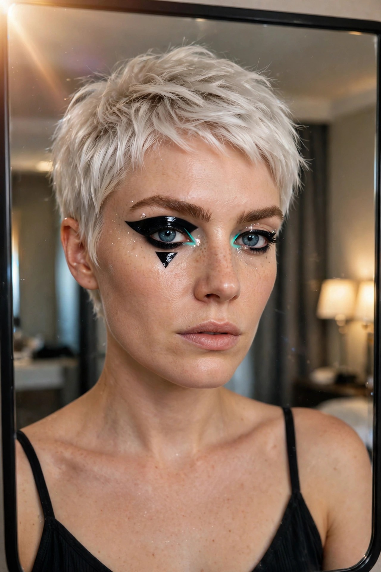
This makeup takes the classic cat eye and pushes it into something much more structured. The black liner sweeps out wide on both sides with a sharp extended wing, but the real focal point is that solid black triangle sitting right under the eye. It feels deliberate and geometric rather than soft or blended.
The teal color peeking through at the inner corners adds a nice pop against the black, and the scattered glitter dots keep everything from looking too flat. I like how the design stays contained to the eye area while still reading as bold and intentional. It would work especially well if you wanted something graphic without covering the whole face in paint.
Web Detail Graphic Eyeliner
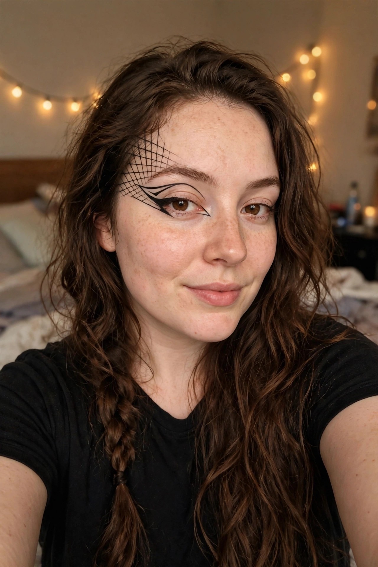
The eyeliner here stands out right away because of that lattice pattern stretching from the outer corner of one eye. It starts with a clean sharp wing and then builds into a delicate web shape using fine black lines. The rest of the face stays relatively bare which lets the design carry all the impact.
I like how the motif stays contained to just one side. It feels balanced without needing matching detail on the other eye or extra colors on the lid. The freckles show through naturally and the skin texture remains visible so the look reads more like wearable art than full face paint.
Bold Graphic Eyeliner With Red Teardrops
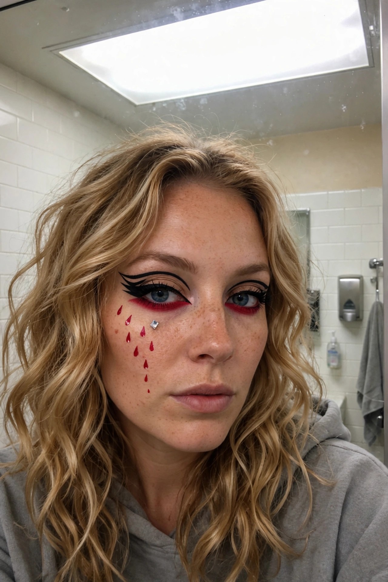
I keep coming back to how sharp the black liner sits on this look. The wings are clean and extended in a way that feels deliberate rather than just dramatic. Then the red underneath the eye flips the whole thing into something much bolder.
Those painted teardrops running down the cheek are what really make it stick in my head. They feel like a simple addition but they change the mood completely. The tiny gem placed near the inner corner keeps the design from looking too heavy or one note.
It reads like a makeup idea you could actually try at home if you have a steady hand and a little patience with the liner.
Sharp Graphic Eyeliner Wings
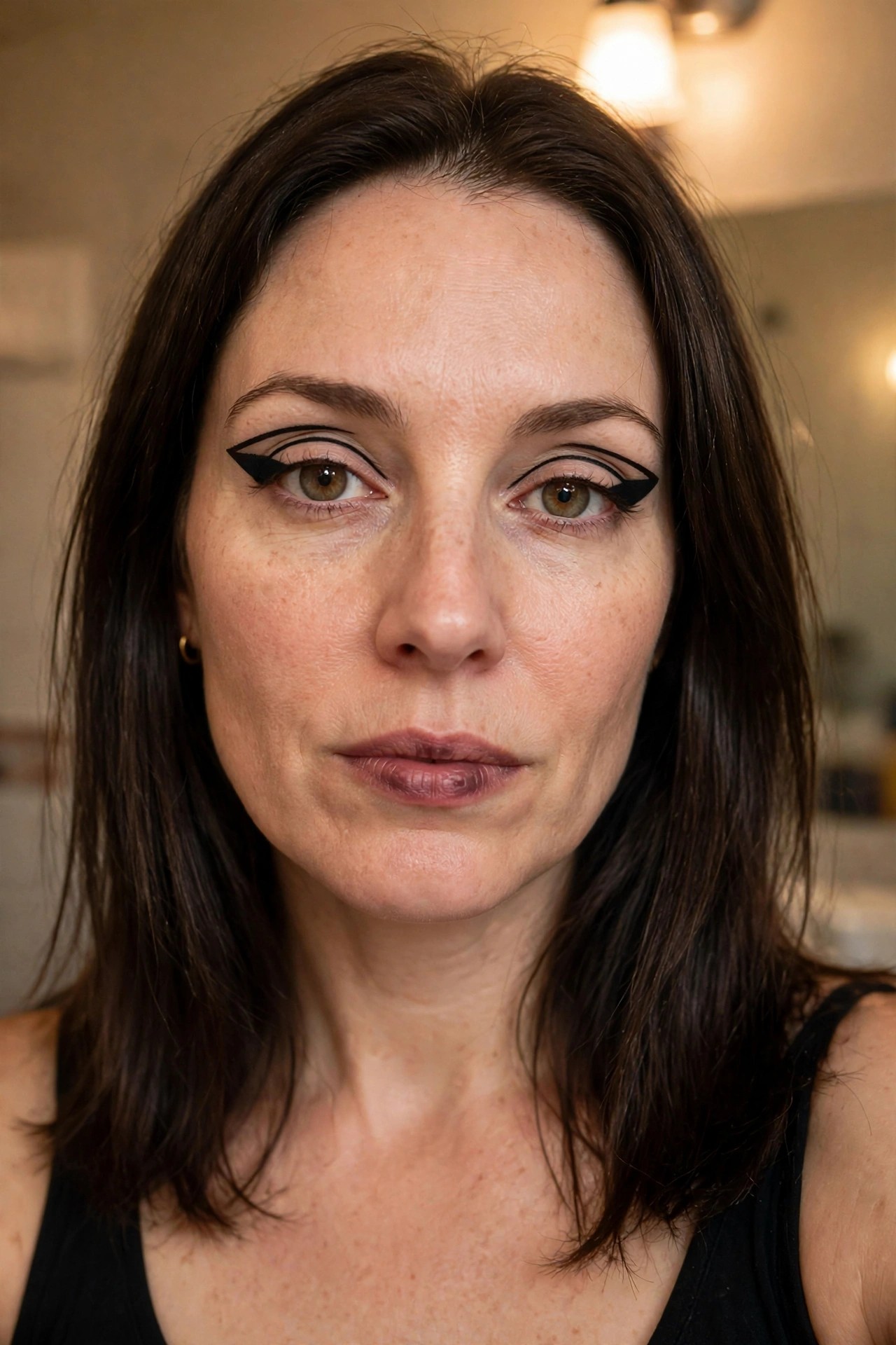
I keep coming back to how clean and deliberate this liner feels. The wings are thick, extended far past the outer corners, and they hold a really sharp angle that almost looks architectural. It is not your usual flick. It reads more like a deliberate shape drawn on with intention.
What stands out is the balance. The liner stays fairly close to the lash line through the middle but flares out dramatically at the end, giving the whole eye a lifted, elongated effect. The rest of the face stays minimal, which lets the graphic element do all the talking. I like that it feels bold without needing extra color or glitter to land the Halloween vibe.
Bold Swirling Graphic Eyeliner
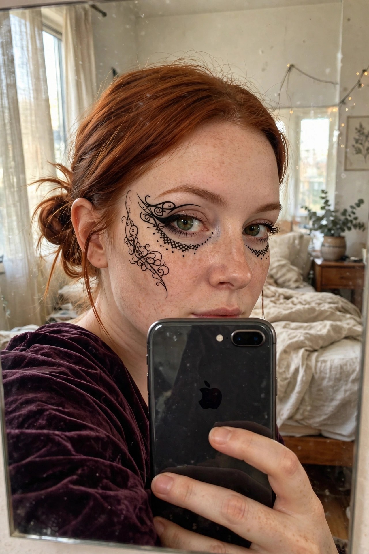
This makeup design really leans into the graphic liner trend but takes it further with those curling flourishes that trail down the cheek. The thick black wing sits close to the lash line and then blooms outward into loops and dots that feel almost like delicate filigree. Under the other eye the pattern is smaller and more dotted which creates a nice imbalance without looking messy.
I like how the lines stay crisp even though the design is quite detailed. It reads as intentional rather than just doodled on. The placement around the temple and cheek gives the whole thing a mask like quality which works well for Halloween without covering the entire face.
Swirling Blue Graphic Eyeliner
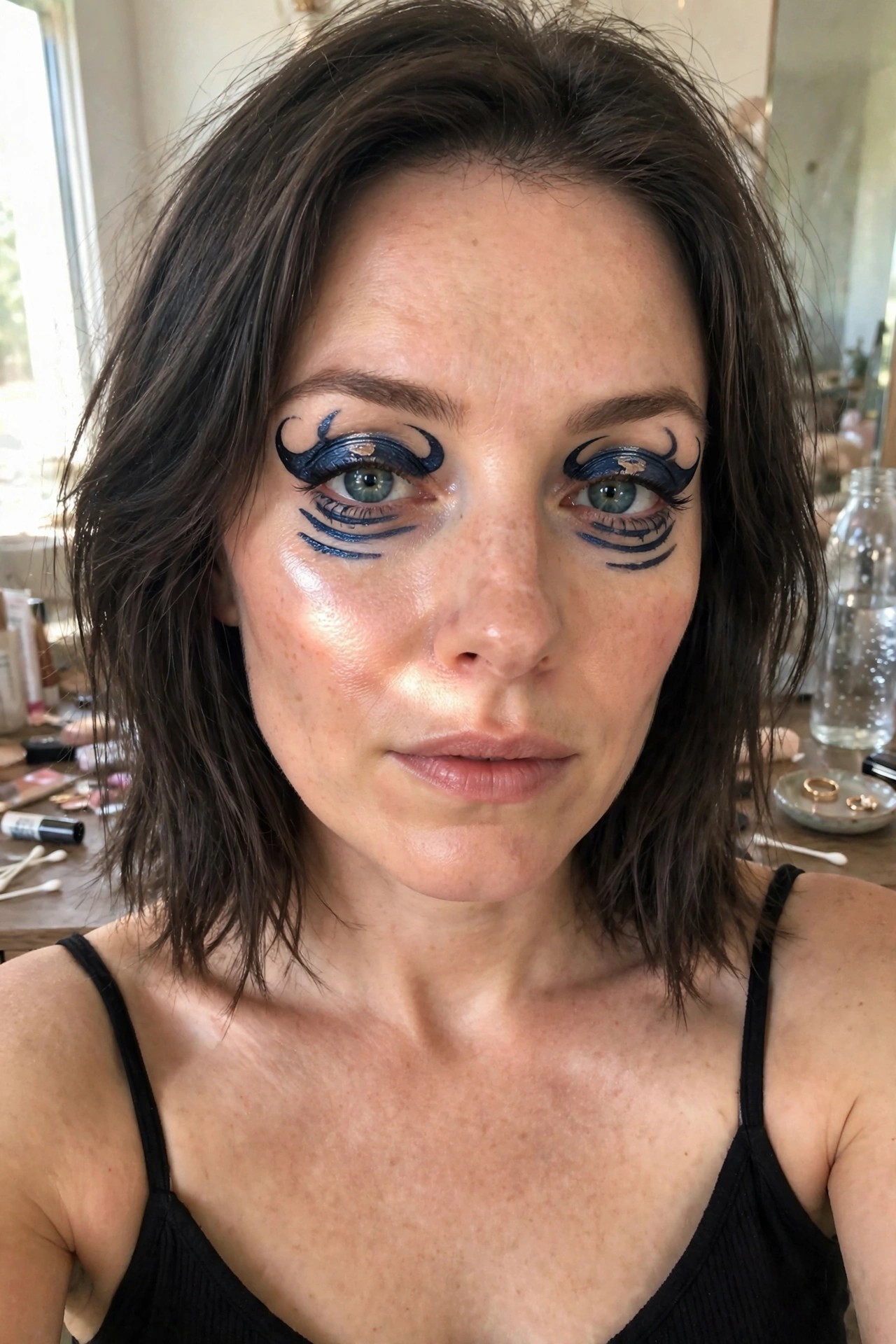
This makeup takes graphic liner way past a simple wing. The design uses deep blue and black to build those curving shapes above each eye and then layers extra lines underneath that fan out like lashes or waves. It feels deliberate and a little surreal at the same time.
I keep coming back to how the color choice shifts the whole vibe. Blue instead of classic black makes the look cooler and more modern while the swirling details give it that extra Halloween edge. The rest of the face stays fairly natural which lets the eyeliner do all the talking.
Neon Lightning Bolt Graphic Liner
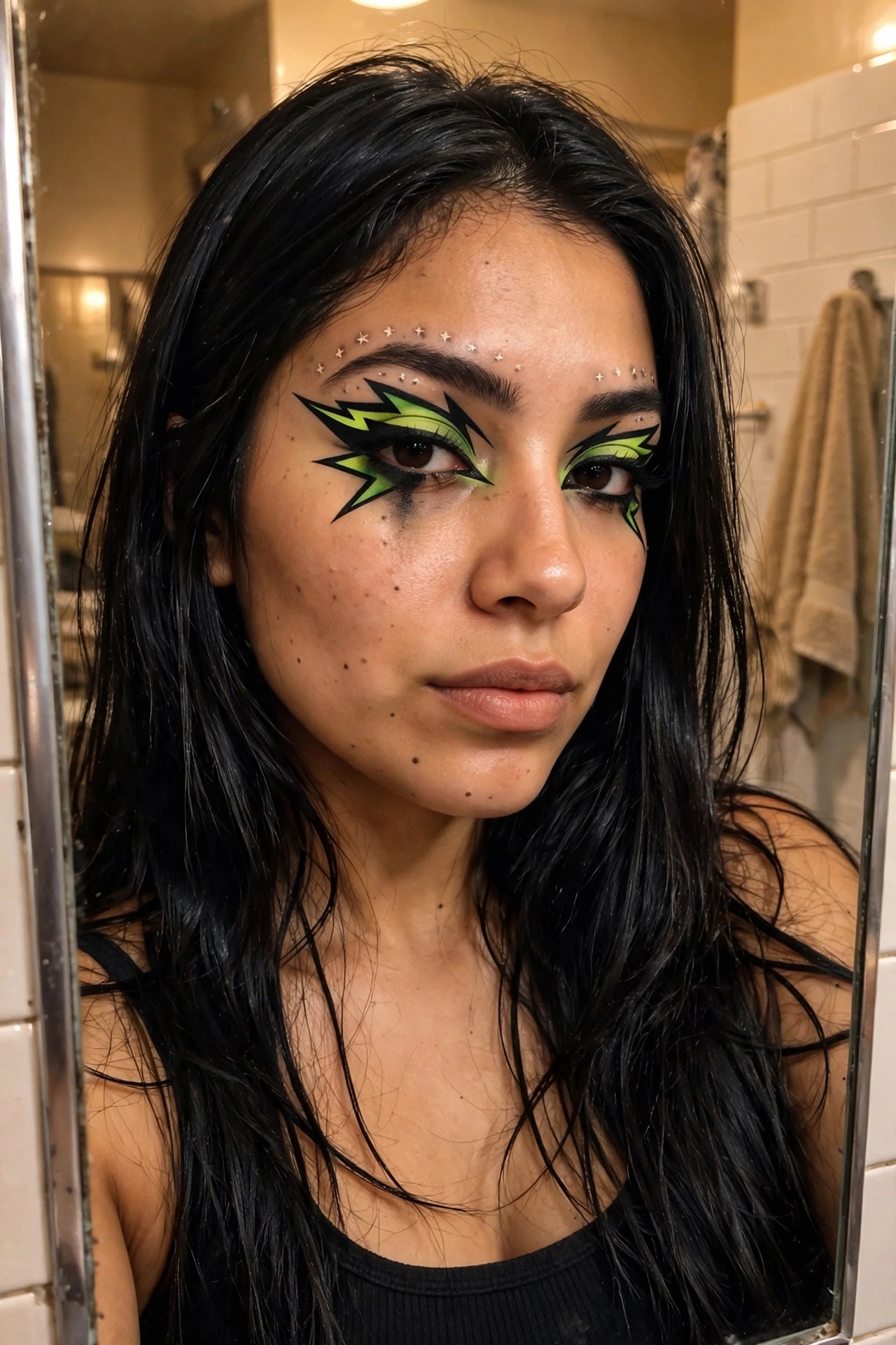
The eyeliner here is doing the heavy lifting. Sharp black wings shoot out into these jagged lightning shapes filled with neon green, and the whole thing feels deliberately oversized without tipping into messy. I like how the color pops right against the black base, especially on the inner corners where the green gets brightest. Those little star accents scattered above the brows add just enough sparkle to keep it from reading flat.
What stands out most is the balance between precision and play. The lines stay crisp even as they flare out, and the slight smudge underneath one eye gives it a lived-in edge that feels intentional rather than sloppy. It is the kind of makeup that works on its own, no full face of paint required.
Mermaid Scale Graphic Eyeliner
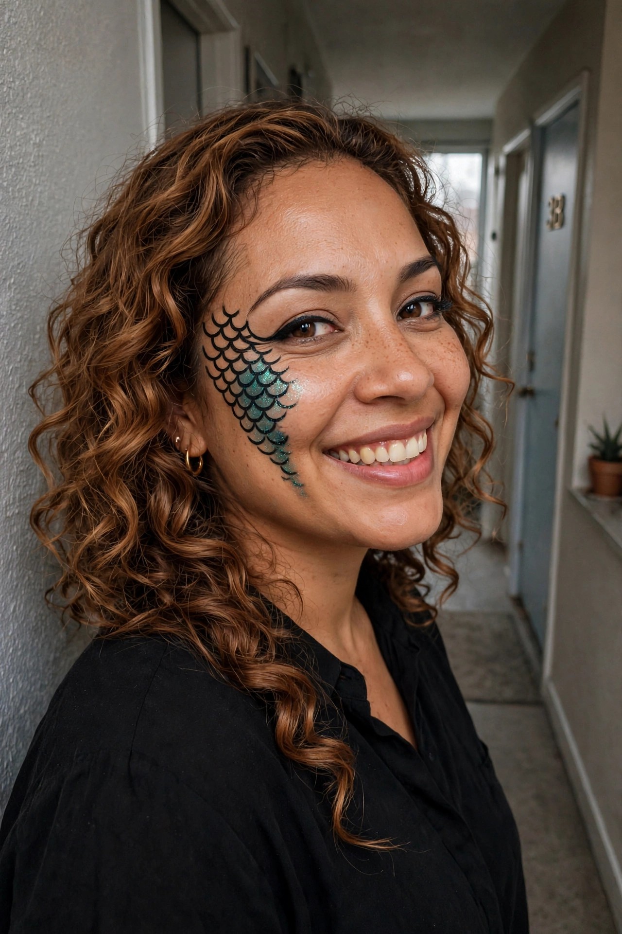
This design uses black liner to draw overlapping half circles that fan out from the outer corner of the eye and curve down along the cheek. The lower scales are filled with teal glitter that catches the light, while the upper outlines stay crisp and sharp. It gives the whole eye area a structured, almost armor like finish without needing extra color everywhere else on the face.
I like how the scales get smaller as they move toward the temple. That tapering keeps the look balanced instead of overwhelming the eye. The glitter placement also stops at the right point so it still reads as eyeliner rather than full face paint.
The smile and natural freckles underneath show that the makeup can sit on real skin without needing perfect coverage. It feels bold but still wearable for someone who wants something more than a basic wing.
Graphic Triangle Eyeliner
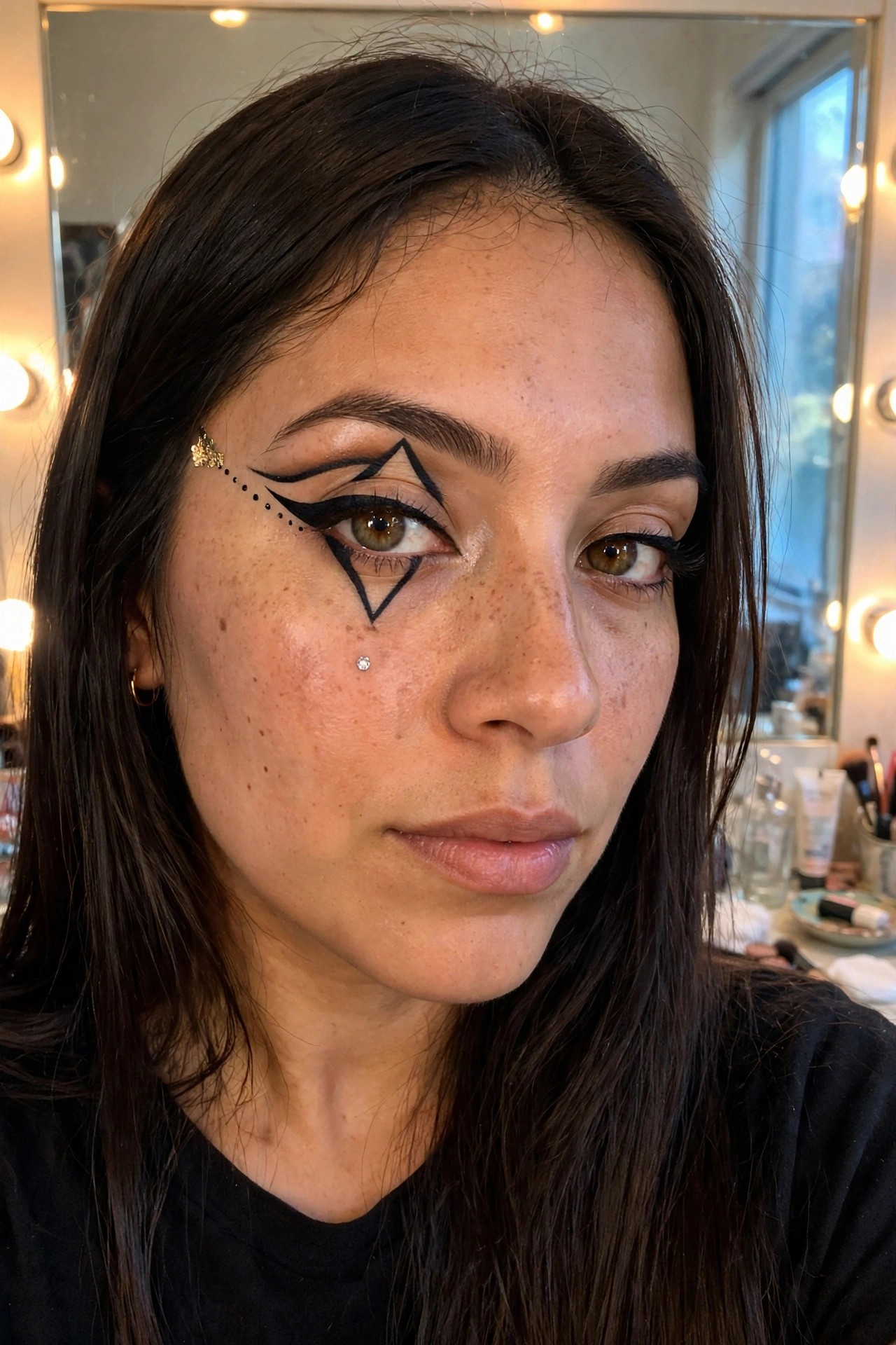
This one caught my attention right away because of how the black liner builds those sharp triangles around the eye. It starts thick at the inner corner then flares out into pointed shapes that almost look like a mask half drawn on. The dotted line trailing toward the temple adds a little extra detail without crowding the whole look.
I like how the design stays mostly on one side yet still feels balanced with the rest of the face. The small rhinestone under the eye and the gold star near the brow keep it from reading too heavy. It is graphic but still wearable if you are comfortable with a bold liner hand.
Spiderweb Graphic Eyeliner
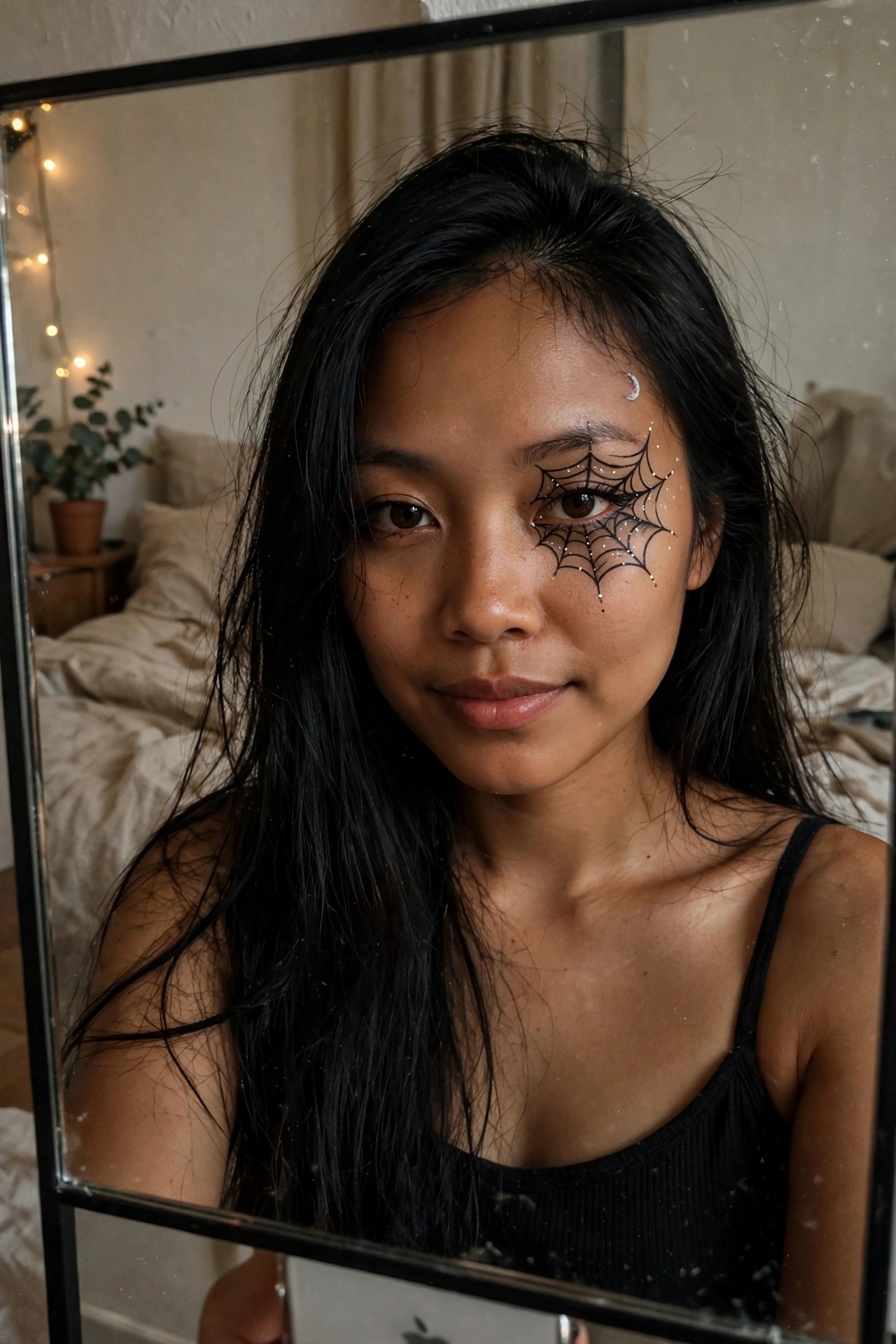
I keep coming back to how precise this spiderweb liner feels. The lines stretch from the inner corner across the lid and out toward the temple in a way that still leaves the eye shape clear underneath. Those scattered white dots give it just enough lift without turning into full glitter overload.
The crescent moon above the brow adds a quiet second element that keeps the look from reading as purely spooky. It sits high enough that it does not compete with the web but still ties the whole side of the face together.
What I like most is the balance. One eye carries the full design while the other stays simple so the makeup stays wearable rather than costume heavy.
Swirling Graphic Eyeliner With Pink Accents
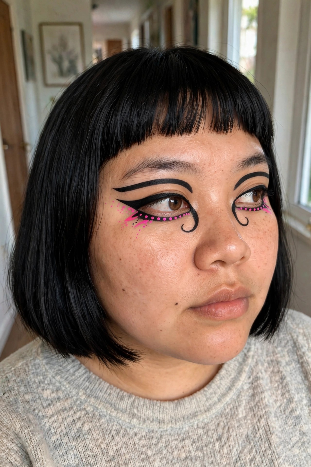
This one caught my eye right away because of how the black liner curves out and loops back in on itself. The design stretches past the outer corner into a little swirl that almost looks like a hook, and then the pink dots follow that same path in a dotted line. A few bright pink splatters add extra movement without feeling random.
I like how the pink breaks up the heavy black so it still reads as bold but has some playfulness too. The placement stays tight to the lash line on the inner part before it flares, which keeps the eye shape recognizable while the outer details do all the work. It feels like something you could build up gradually if you wanted to test the look first.
Cracked Gold Graphic Eyeliner
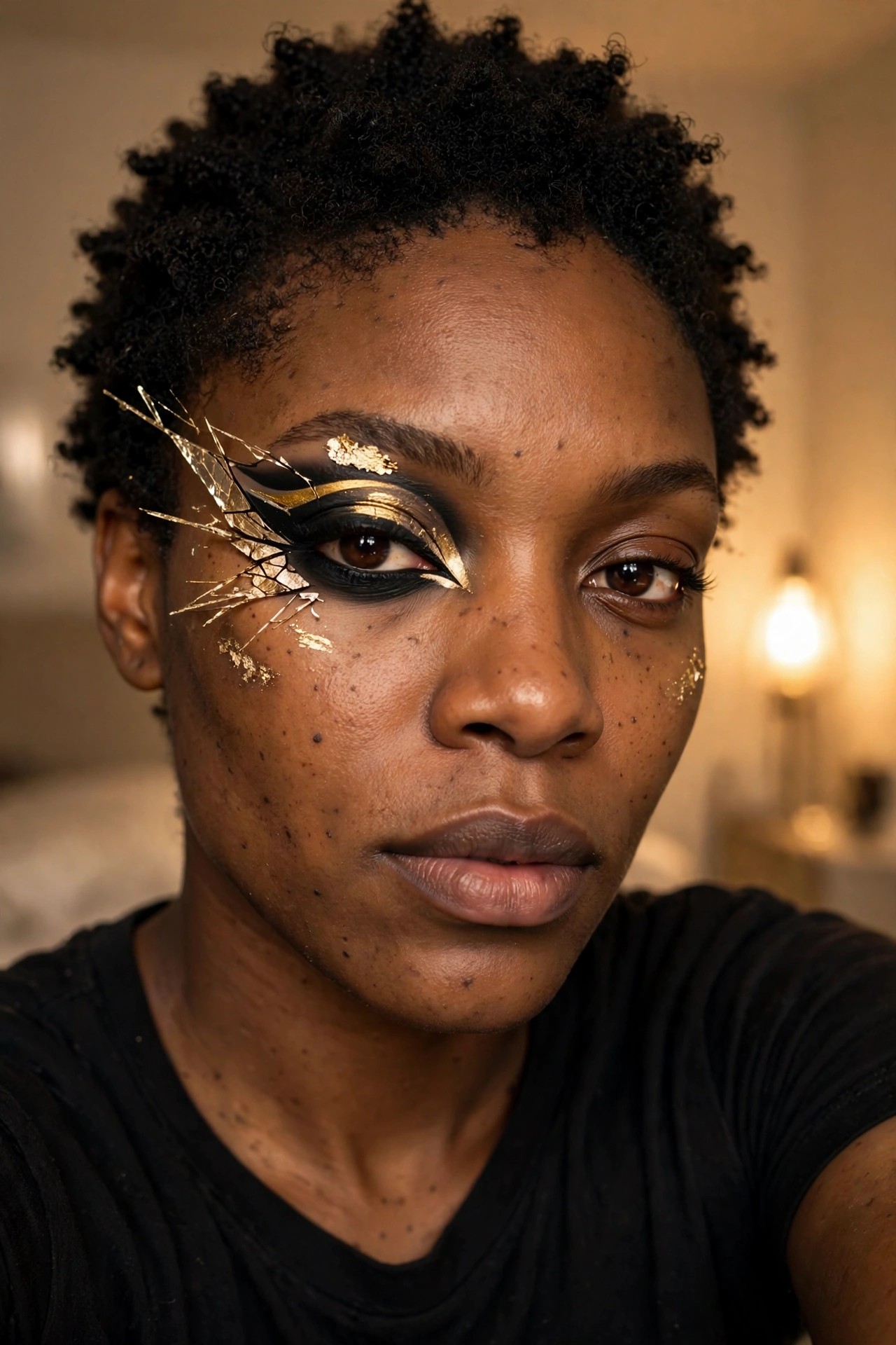
This makeup takes a classic winged liner and breaks it open with shards of gold foil that look like they are splitting across the skin. The black base stays sharp and heavy while the gold pieces scatter outward in uneven lines, some catching the light more than others. A few smaller flecks land lower on the cheek, keeping the whole thing from feeling too contained.
I like how the gold is not just a highlight but part of the actual structure of the design. It turns the liner into something that feels damaged and deliberate at the same time. The rest of the face stays fairly neutral, which lets the eye area carry all the weight.
Starburst Graphic Eyeliner
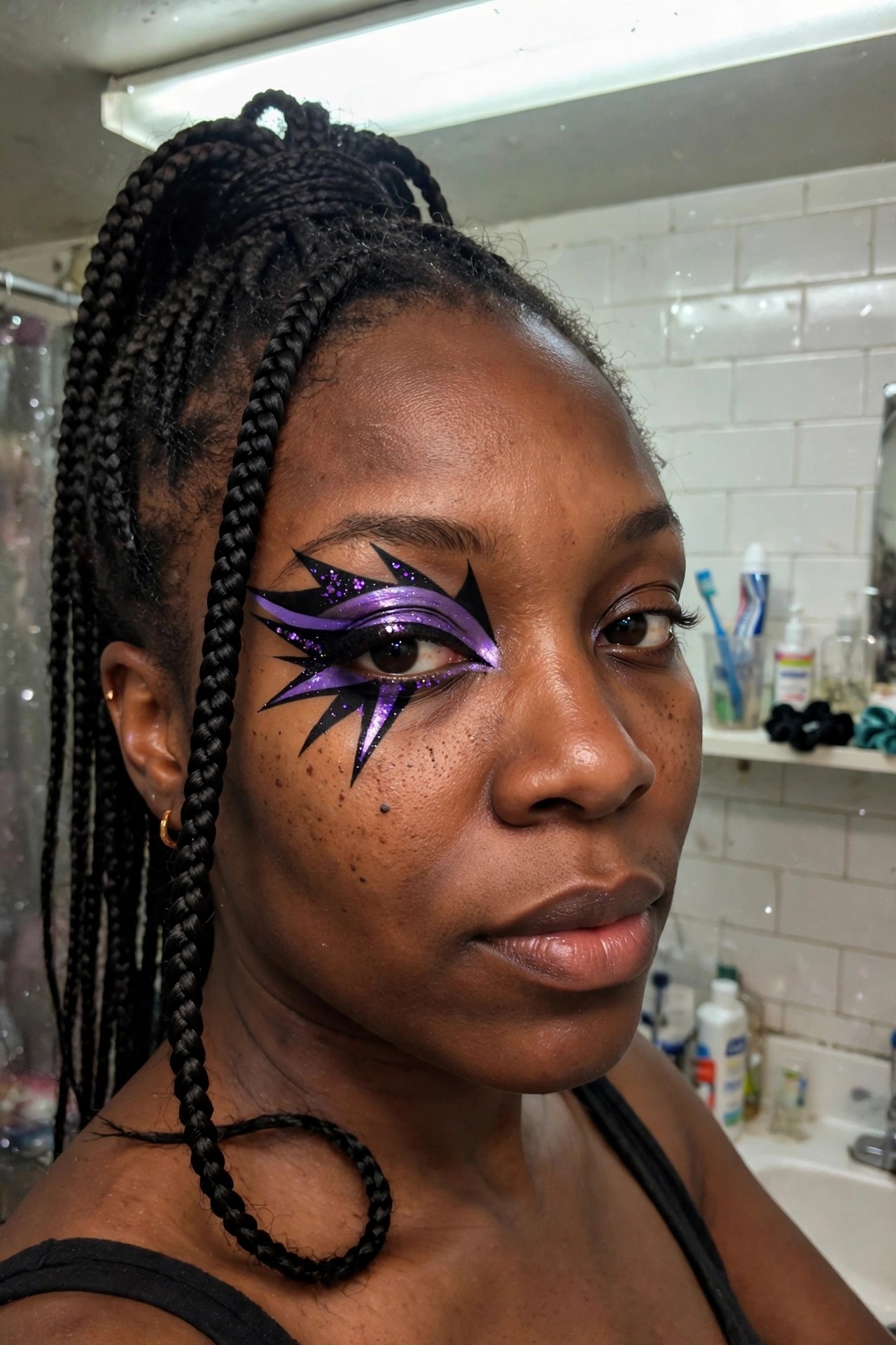
I keep coming back to how sharp those black points are. They shoot out from the lid in five or six directions and the purple shimmer sits right in the middle like it is glowing from inside the design. The glitter catches just enough light to make the whole thing feel electric without looking messy.
What I like most is the balance. The black liner stays crisp even where it flares out and the purple stays contained so it reads as one bold shape instead of random lines. It feels finished but still daring enough for a night out.
Frequently Asked Questions
Q: How do you keep graphic eyeliner sharp when your hand shakes a little? A: Practice on paper first to steady your strokes. Use tape as a guide for straight edges on your lids. Go slow and build the line in thin layers.
Q: Is there a trick to making the colors stand out more at night? A: Layer a white base under bright shades to make them pop. Then apply the color on top with a thin brush. This helps the graphic parts show up better in low light.
Q: What if the design starts to flake after a few hours? A: Set your liner with setting spray after you finish. That prevents most flaking through the evening.
