

I keep coming back to how much room there is for actual play when it comes to Halloween makeup. Not just the usual cat eye or blood drip, but the ones that feel like someone sat down and decided to redraw the rules a little.
Some of these looks lean hard into graphic lines and unexpected color placement. Others stay closer to real skin but still manage to look completely transformed. I noticed a few that could probably work for a party and a few that would only make sense once a year, and honestly both directions feel worth trying.
What surprised me most was how many of them still read as wearable even while being completely over the top. If you’ve been waiting for an excuse to test something bolder with your liner or add a few rhinestones where they don’t normally go, this batch might be the nudge.
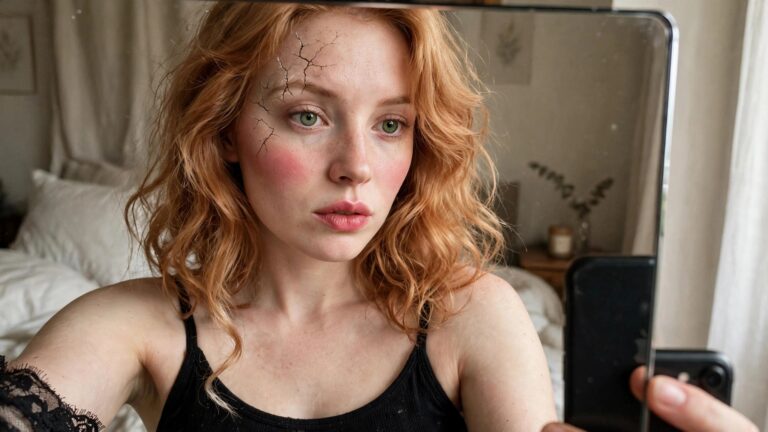
Cracked Porcelain Doll Makeup

This makeup takes the classic broken doll idea and makes it look almost too real. The black crack lines start high on the forehead and spider down across one eye with that uneven, shattered texture. The shading around the eye adds a bruised feel that makes the whole effect land somewhere between eerie and strangely pretty.
I like how the rest of the face stays fairly soft with the pink blush and simple lip color. It keeps the look from tipping into full horror territory while still reading as a deliberate Halloween choice. The cracks feel precise enough that you can tell some time went into them, yet they still have that imperfect hand drawn quality that sells the porcelain illusion.
Starry Galaxy Forehead Makeup

This one caught my attention right away because the design stretches across the forehead in a full night sky pattern. The colors move from deep blue into soft purple with a scattered dusting of glitter that catches the light. Different sized stars sit throughout the area and some extend down toward the temples and outer eye corners.
The eye makeup stays in the same color family with darker shades blended through the crease and a lighter shimmer on the lid. It feels cohesive without trying too hard to match every single detail. What I appreciate is how the forehead stars stay delicate rather than overwhelming the face. The placement keeps the look balanced even though the design covers quite a bit of skin.
I would probably wear this for a low key party where people notice the details up close. It reads creative but still wearable for someone who does not want full face coverage.
Stitched Mouth Makeup

This stitched mouth design caught my attention right away because the black thread details sit right across the lips in a way that looks both precise and a little unsettling. The dark liner creates the illusion of actual sutures pulling the mouth closed and the deep berry lipstick underneath keeps the whole thing from reading as just a simple line drawing. Around the edges there is a faint bruised tone that adds dimension without overpowering the main stitch pattern.
I like how the look stays focused on one strong element rather than covering the entire face. It still leaves room for normal eye makeup and brows so the effect feels wearable for a party while staying clearly Halloween. The placement follows the natural shape of the lips which makes the stitches look more believable from a distance.
Floral Sugar Skull Makeup
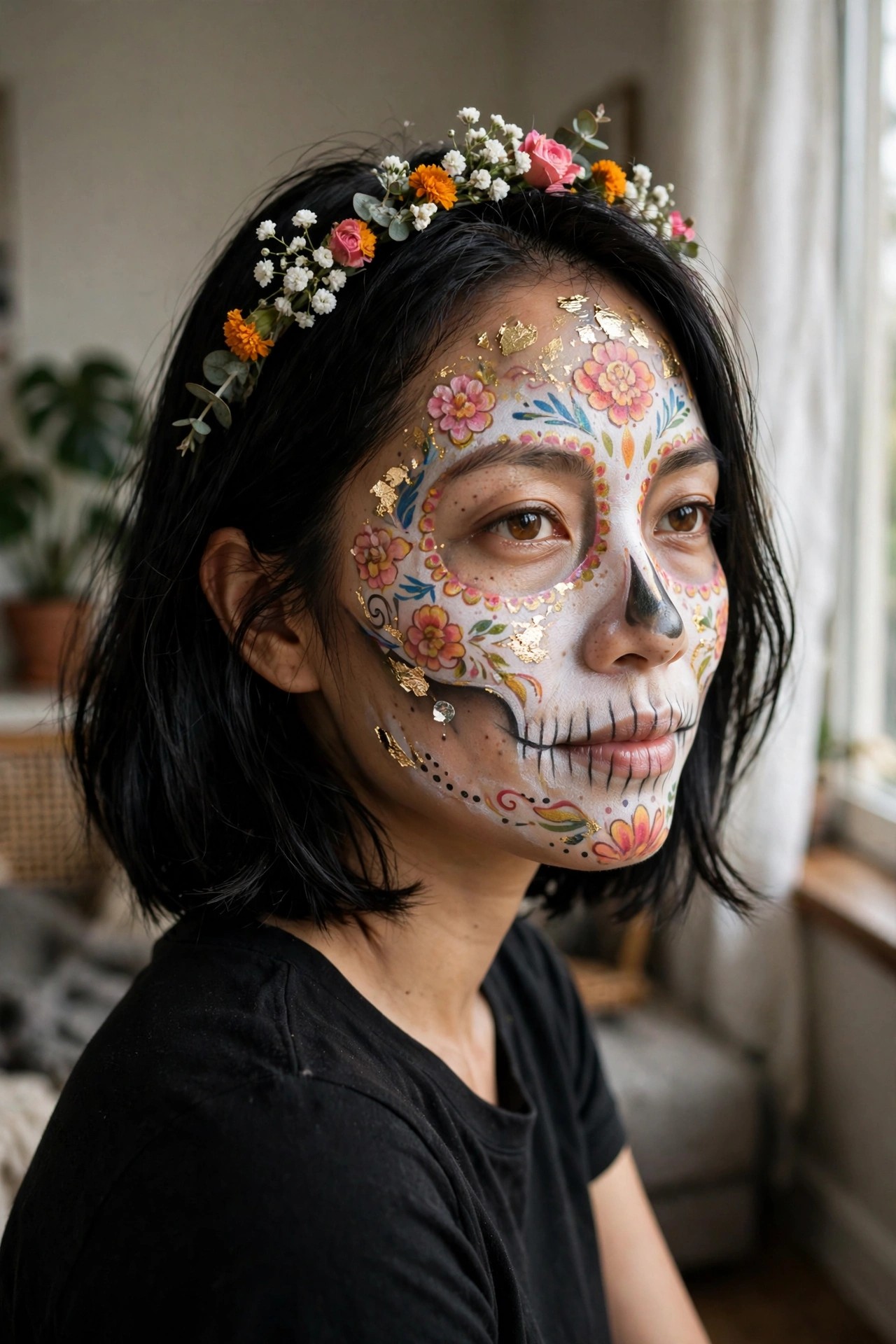
This sugar skull design stands out because of how the flowers are placed around the eyes and across the cheeks. The white base gives a clean canvas while the pink, orange, and yellow blooms add color without overwhelming the skull lines. Gold leaf scattered over the forehead and temples catches the light and keeps the whole look from feeling flat.
I like the way the black nose and stitched mouth are kept simple so the brighter elements can shine. The small crystal near the jaw is a nice touch too. It feels finished but not overdone.
The flower crown with marigolds, roses, and baby’s breath ties the colors on the face together without competing for attention. It reads as one cohesive idea rather than separate pieces.
Cracked Porcelain Makeup
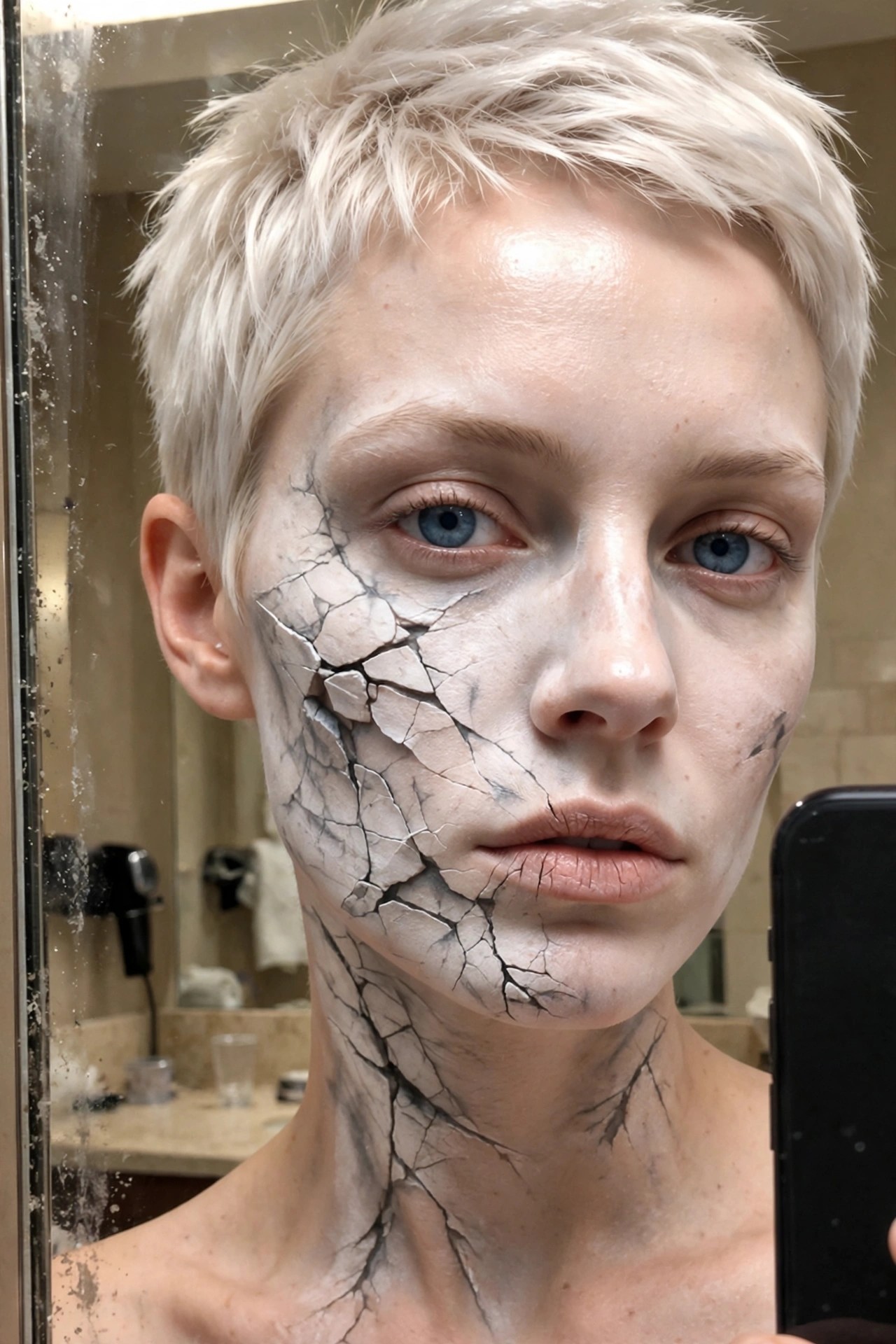
This makeup takes the idea of a broken statue and runs with it in a really direct way. The face is covered in a pale base that looks dry and matte, then split into irregular pieces with dark lines running through them. Some sections sit slightly raised while others sink in, which gives the whole thing that fractured texture without needing extra props.
The cracks continue down the neck and onto the upper chest, so the effect feels complete rather than cut off at the jawline. Around the eyes and mouth the lines are finer, which keeps the features readable while still selling the broken surface. The short pale hair frames it cleanly and lets the makeup stay the main focus.
I like how the design stays simple in color but still reads as something fully finished. It would work for anyone who wants a striking look without adding layers of costume pieces on top.
Neon Circuit Board Makeup
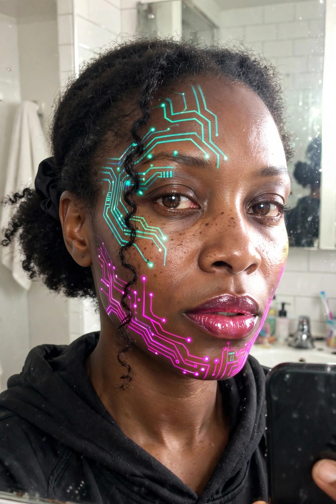
This one caught my eye right away because the lines actually look like they are wired into the skin. The upper half of the face stays in that bright cyan with clean circuit paths running across the forehead and temple while the lower half shifts into a hot pink that follows the jaw and cheek. The dots sit at the junctions like little nodes and the whole thing feels deliberate rather than scattered.
I like how the design stays readable even when the head turns slightly. The pattern does not fight the natural shape of the brows or mouth, it just rides along them. It gives a strong tech vibe without needing extra props or heavy base layers, which makes it feel wearable for longer than most full face pieces.
Dramatic Vampire Eye Makeup with Fangs

The eye makeup here is the real star. Heavy layers of deep burgundy and black shadow create that sunken, intense look, and the black tear running down one cheek adds a nice touch of melancholy. The pale base makes the freckles stand out even more, which feels intentional rather than covered up.
I like how the dark lip color stays matte and slightly cracked at the edges. It pairs with the small white fangs without going overboard. The overall effect reads as classic vampire but with enough personal detail to feel fresh.
Bat Wing Graphic Eyeliner
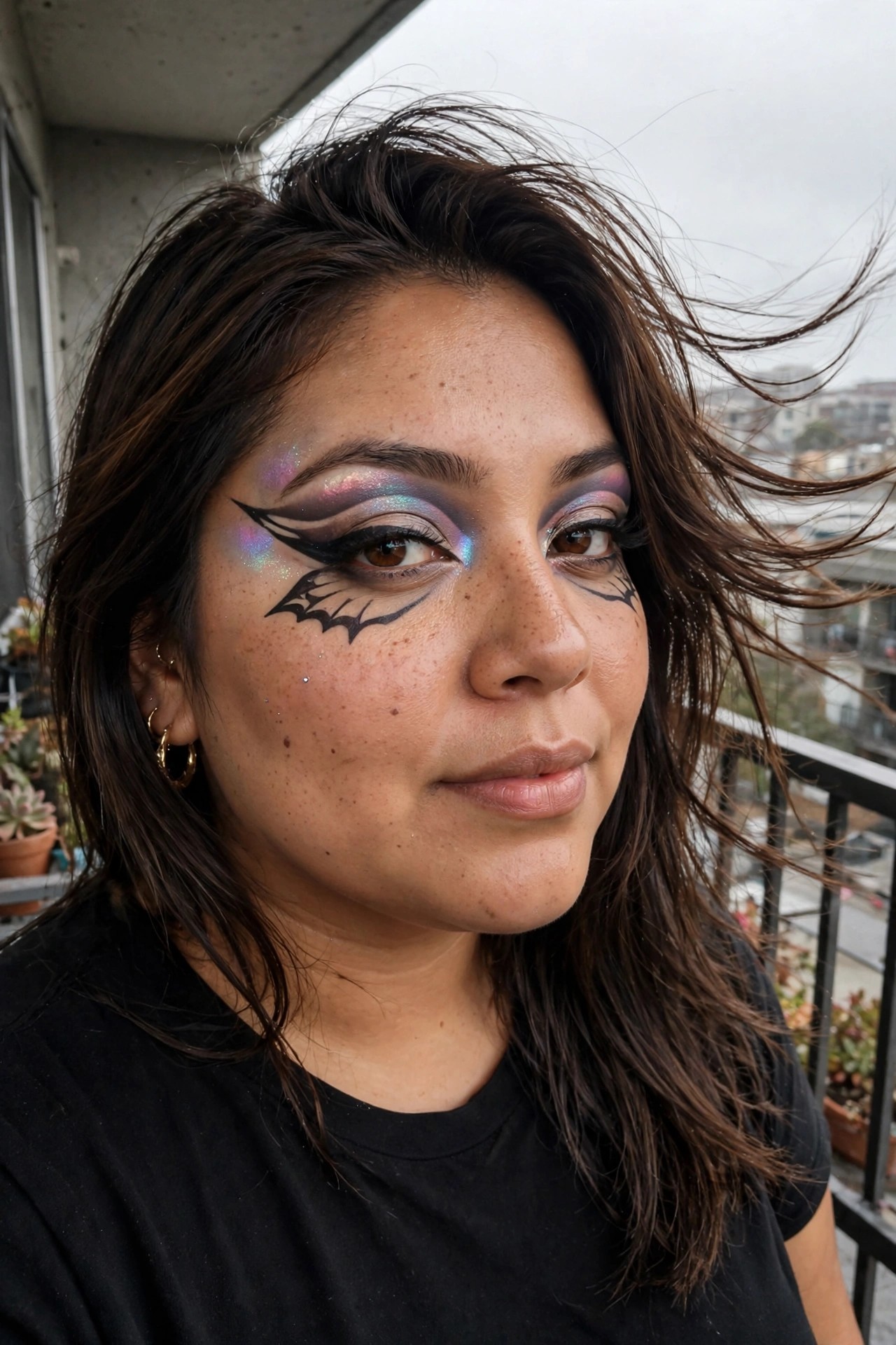
This one caught my attention right away because of how the liner actually forms little bat shapes instead of stopping at a regular wing. The black lines curve out and create that wing silhouette on both sides, with one side getting an extra full bat body painted just under the eye. It feels intentional but still wearable if you have steady hands and a fine brush.
The eyeshadow underneath shifts through pinks, purples, and blues with a lot of shimmer, which keeps the whole thing from looking too flat or harsh. There are also scattered glitter dots across the cheek and near the brow that catch the light without overwhelming the design. I like that the skin is left mostly natural otherwise, so the focus stays on the eye work instead of competing with heavy foundation or contour.
It reads as a clear Halloween choice without needing a full face of character makeup, which makes it useful if you want something detailed but not exhausting to apply.
Starry Night Eye Makeup

This makeup turns the whole eye area into a little piece of night sky. The base is a deep smoky blend that fades from black at the outer corners into a moody blue, and then the real detail work starts with all those tiny stars. Gold and silver glitter dots are scattered across the lids and cheekbones in different sizes so it does not look too uniform.
I like how the stars spill past the usual eye makeup boundary and land on the skin below. It gives the whole thing a floating constellation effect instead of stopping at a sharp line. The placement feels random in the best way, like someone flicked glitter across their face and it just happened to land perfectly.
Half Skull Makeup With Jeweled Eye Frame
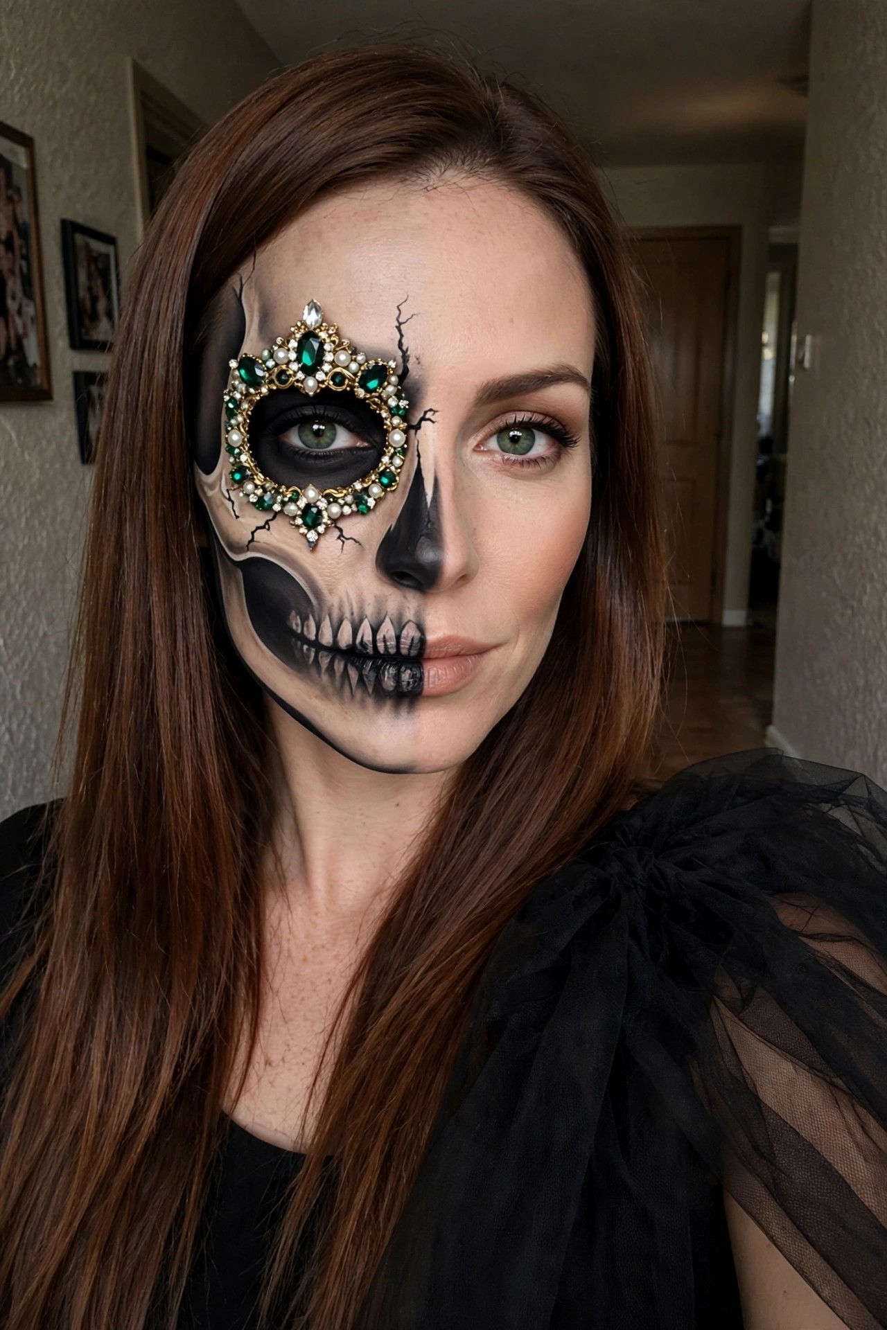
This one caught my attention right away because the split is so clean. One side of her face stays mostly natural with regular foundation and lip color while the other side turns into a full skull with black shading around the eye socket and teeth painted over the mouth. The cracks running through the paint make it feel a little broken and eerie without going over the top.
What really stands out is the jeweled piece covering the left eye. It has green stones mixed with pearls and sits right where the socket would be on a real skull. It adds a touch of glamour that keeps the whole look from feeling too plain or simple. The black paint stops at the center so the contrast stays sharp and the design reads clearly even in a close shot.
I like how the makeup still lets her actual eye show through on the skull side. It gives the whole thing a slightly unsettling effect that works well for Halloween without needing extra props or layers.
Emerald Serpent Scale Makeup

The scales catch my attention first. They curve along the cheekbone and sweep up toward the temple in overlapping layers of deep teal green with just enough shimmer to catch the light. Gold leaf edges break up the pattern so it feels less like a sticker and more like something living.
I like how the design stops short of covering the whole face. It leaves the opposite side bare, which keeps the look wearable while still reading as a clear Halloween statement. The metallic gold accents add a touch of polish without turning it into full glitter overload.
What stands out most is the placement around the eye. The scales follow the natural curve there, making the whole thing feel intentional rather than random. It works as both face paint and a strong makeup idea depending on how much time someone has.
Comic Book Dot Pattern Makeup
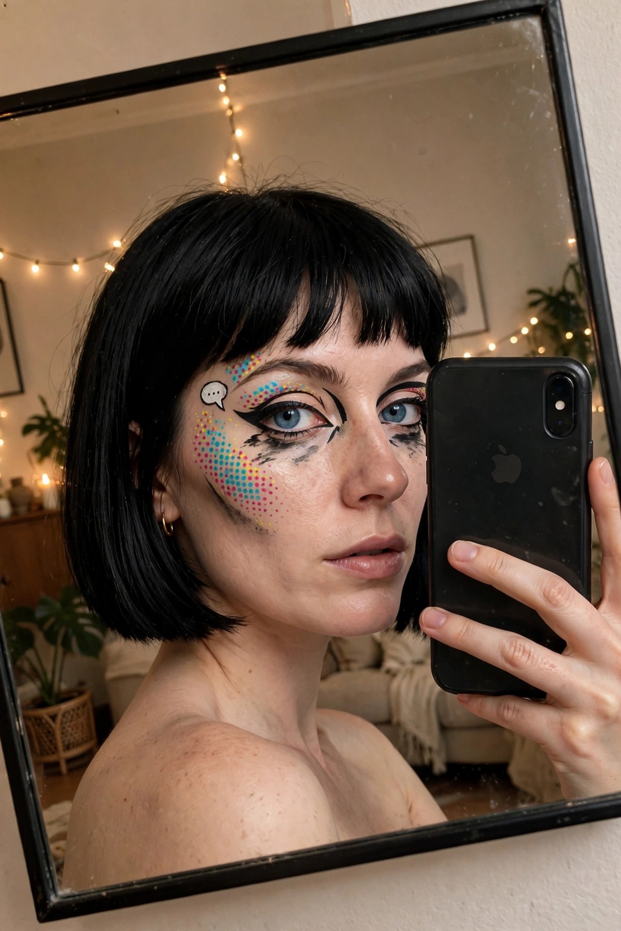
This one caught my eye right away because of how the colorful dots sweep across the cheek in that perfect arc. The dots shift from cyan to pink to yellow, almost like a halftone print that got interrupted by heavy black liner. The thick winged liner on both eyes feels dramatic on its own, but the way it connects to the smudged edges on the right side makes the whole thing feel a little off kilter in a good way.
I like the little speech bubble detail too. It sits right where a cheekbone highlight would normally go, and those tiny dots inside it tie the whole cheek design together without feeling forced. The bare skin everywhere else keeps the focus exactly where it should be, on the graphic elements.
Mermaid Scale Face Makeup

This one caught me right away because the scales actually follow the curve of her face instead of sitting like a sticker. They start high on the forehead and sweep down over one eye and onto the cheek with that soft iridescent shift from blue to pink to lavender. The glitter catches light in tiny bursts so the whole thing feels alive rather than flat.
The lashes match the same color story with little flecks of sparkle along the tips. It keeps the look pulled together without needing extra colors elsewhere. I like how the design stops short of covering the entire face so her natural skin still shows through on the other side.
It reads as mermaid without turning into full body paint or a costume. The placement feels thoughtful and the scale edges blend nicely into the skin so nothing looks too harsh under regular lighting.
Clock Face Makeup
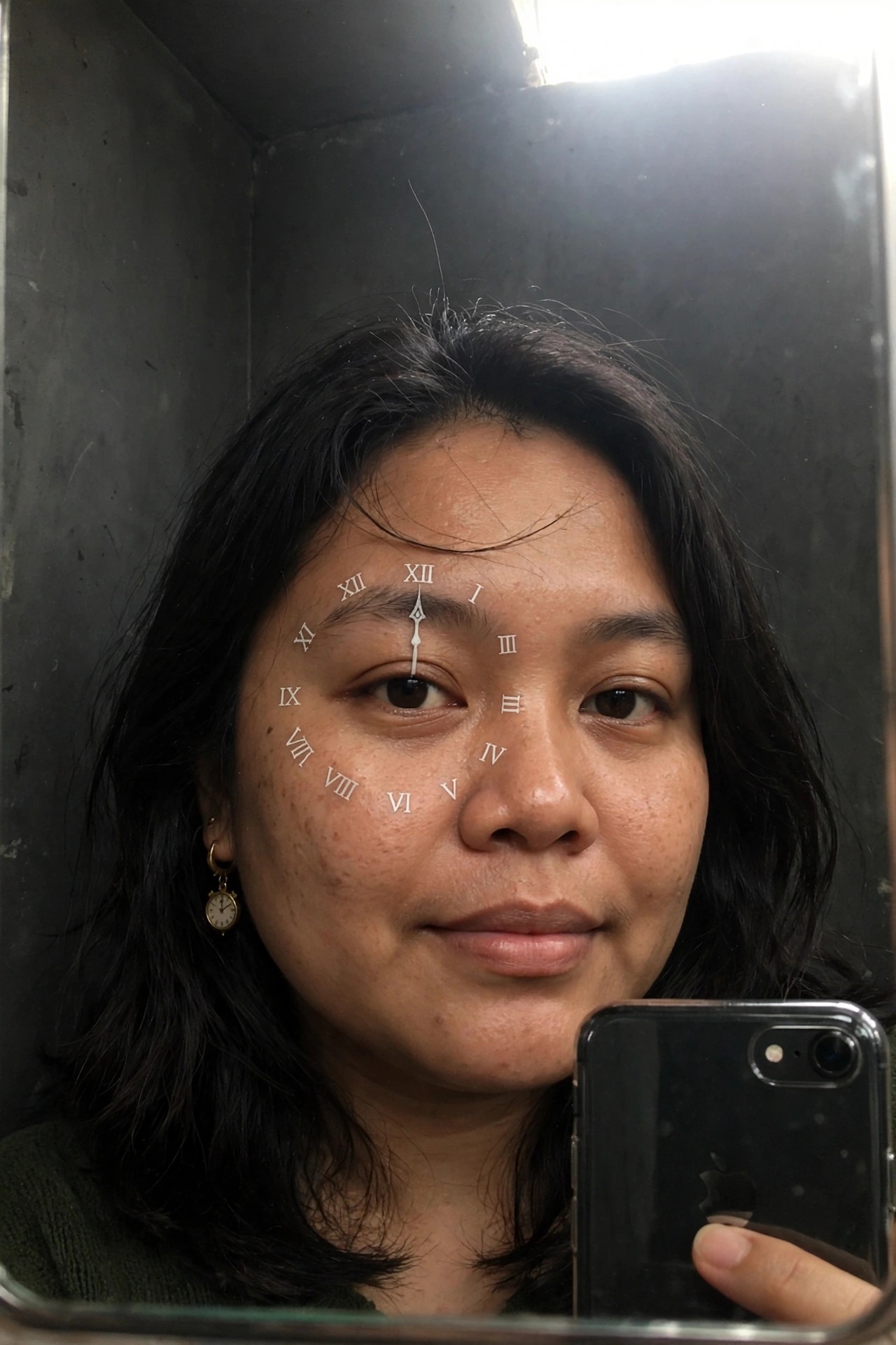
I spotted this clock design right away because the face is literally built around the eye. The Roman numerals sit in a neat circle with XII at the top and the hands pointing straight up at noon. It feels precise without looking too stiff.
The numbers run from I down through VI and back up to XII, and the shading around the eye keeps the whole thing readable even up close. I like how the design uses the natural eye placement as the center point instead of fighting it.
What stands out is the clean execution on real skin texture. No heavy blocking, just the lines and numerals sitting naturally.
Floral Face Paint Design
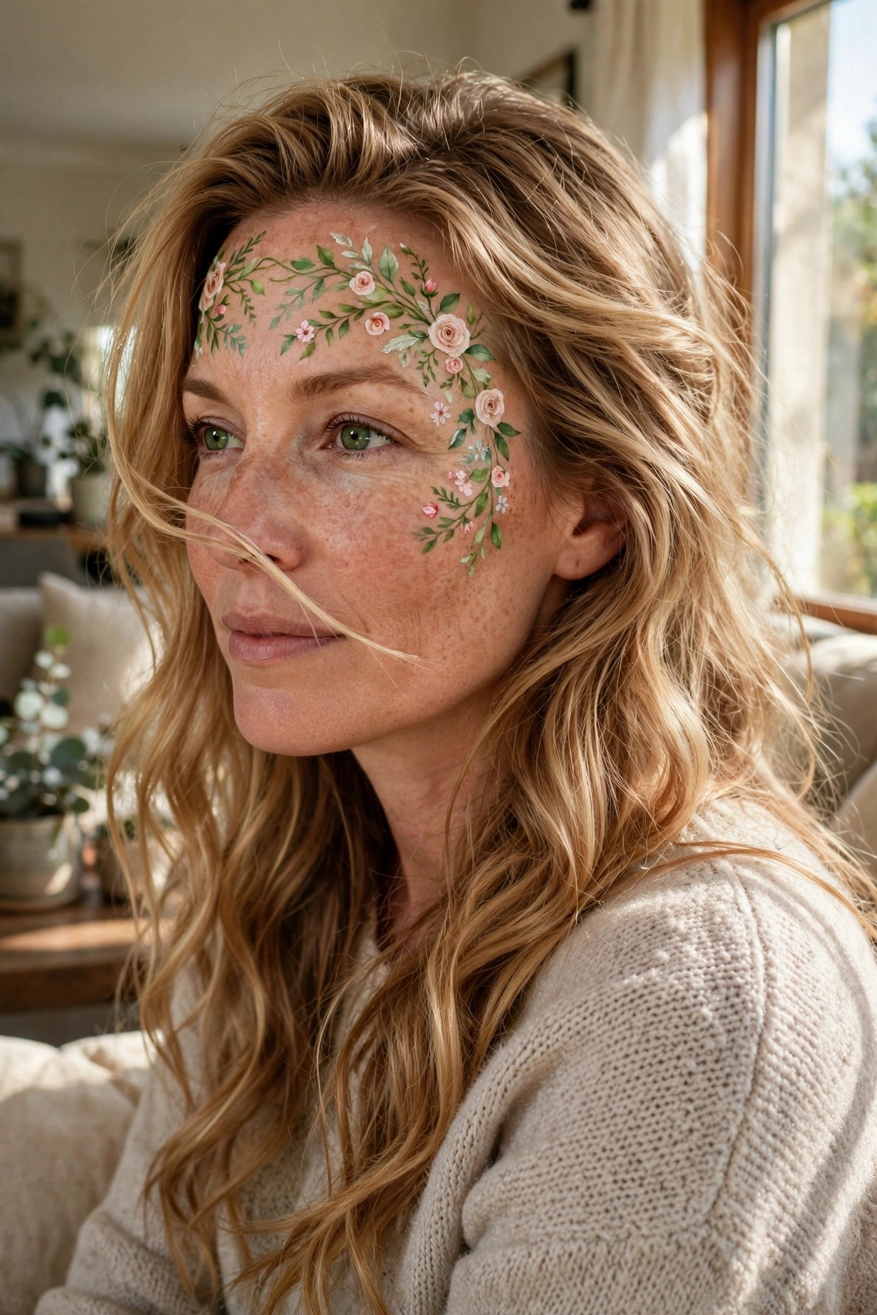
I keep coming back to how soft this one feels. The flowers trail from the forehead down toward the cheek in a loose arc, with pale pink roses mixed among smaller blooms and plenty of green leaves. It reads like a living headband painted right onto the skin rather than a heavy mask.
The placement matters. It sits high enough to frame the eyes without blocking them, and the way the design curves follows the natural shape of the brow and temple. A few tiny buds and stems fill in the gaps so nothing looks sparse. The color stays gentle, which makes the whole thing feel more like wearable art than typical Halloween paint.
What I like is how it still registers as costume makeup even though nothing screams scary or dramatic. You could wear it with almost any outfit and it would read as intentional.
Serpent Scale Face Paint

This makeup takes a simple idea and runs with it in a way that feels fresh. The scales start right along the jawline and sweep down the neck in overlapping layers of green and gold. They catch the light just enough to look almost wet without going overboard on shine.
I like how the design stops short of covering the whole face. It leaves the upper half natural so the eyes and brows stay the center of attention while the lower half does all the storytelling. The color shift from deeper green at the edges to warmer gold in the middle keeps it from looking flat.
The application looks precise but still organic, like the scales could actually move if she turned her head too fast. It reads as a full character choice without needing extra props or a complicated costume on top.
Jack Skellington Stitched Mouth Makeup
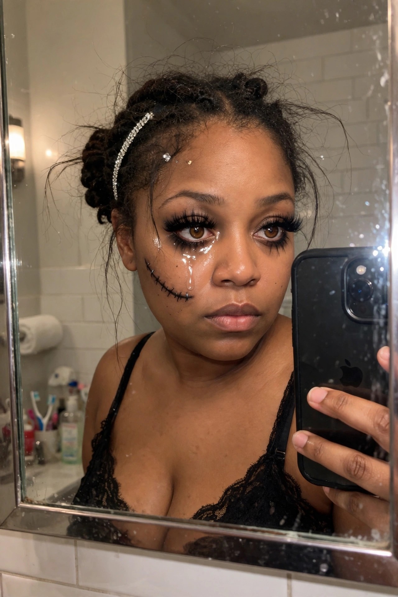
The stitched line running across her cheek is the first thing that pulls you in. It looks hand drawn with small black dashes and dots that curve upward like a permanent half smile, exactly like the character from The Nightmare Before Christmas. The placement sits right along the natural line of her face so it reads clearly even in a close mirror shot.
Heavy black liner and long lashes frame both eyes, but the real detail work sits under the left eye where a clear drip trails down the cheek. It gives the whole look that slightly eerie, melting quality without needing extra color. A few scattered rhinestones near the temple add just enough sparkle to keep it from feeling flat.
I like how the makeup stays focused on one strong idea instead of piling on extra elements. The stitch work and the drip do most of the storytelling.
Flame Eye Makeup Design

This eye look immediately grabs attention with those bold black bases and the way the orange and yellow flames shoot outward. The design wraps around both eyes and stretches toward the temples, creating a real sense of movement without feeling overly symmetrical. I appreciate how the black stays heavy on the lids while the color only appears in the flame shapes, keeping the whole thing readable even from a slight angle.
The glossy black lips pull everything together and stop the eye makeup from floating on its own. It feels like a complete face rather than just a pair of dramatic eyes. What stands out most is the balance between the graphic flame lines and the softer smoky edges around the lashes. It reads as intentional instead of messy, which makes the idea feel more wearable than it first appears.
Moon Phase Eye Makeup

The eye look here really stands out because of how the colors shift. There is a soft purple base that fades into this silvery blue shimmer across the lids and it catches light in a way that feels almost liquid. The cut crease is clean but not harsh which keeps everything wearable while still dramatic.
What I keep noticing are the little moon phases drawn along the cheeks in that same holographic finish. They look hand painted and the placement feels balanced without being perfectly symmetrical. A few clear rhinestones sit above the brows and add just enough sparkle without overwhelming the rest of the design.
I like that the glitter stays concentrated under the eyes and on the inner corners. It gives the whole thing a dreamy night sky feeling while still reading as makeup you could actually attempt at home.
Cracked Porcelain Makeup with Gold Accents
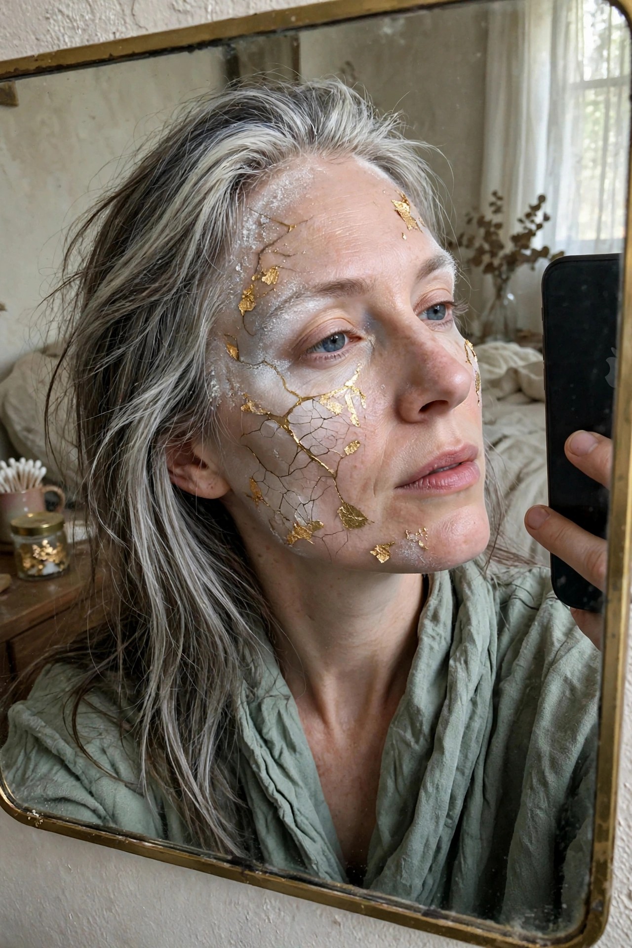
This makeup takes a simple white base and turns it into something much more interesting. Fine cracks spread across the forehead and down the left side of the face with gold leaf tucked into the breaks. The gold catches light in small patches rather than covering everything so the effect stays delicate instead of heavy.
I like how the design keeps the rest of the face fairly natural. The lips stay soft and the eyes stay clean which lets the cracks and gold do the work. It feels like a quiet nod to repair and imperfection instead of a full character mask.
Butterfly Wing Eye Makeup

This butterfly design really leans into the detail work. The wings stretch out from the inner corners of the eyes and fan across the temples with soft blends of purple, teal, and blue. You can see the vein lines painted in to give them that actual wing texture. Rhinestones sit along the upper edges in matching shades and catch just enough light to stand out without overpowering the colors.
I like how the shape stays balanced on both sides even though the wings are fairly large. The outer edges have a slight scallop that keeps the look from feeling too soft or too sharp. It reads as intentional face paint rather than just bold eyeshadow, which fits the creative flair the article is going for.
Black Grin Face Paint Design
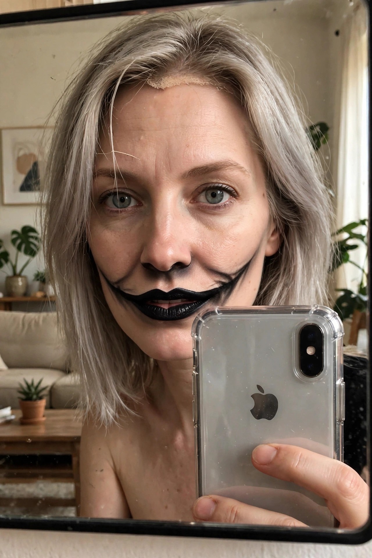
I keep coming back to how the black paint stretches across the lower face here. The lines curve upward from the corners of the mouth and meet the cheeks in a way that turns a normal smile into something much wider and stranger. The solid black lips sit right in the center so the whole shape reads as one continuous grin even when the mouth moves.
What stands out is the thickness of the lines and how they stop just before reaching the nose. It leaves enough skin showing that the design still feels like makeup rather than a full mask. The forehead strip adds a small extra detail but the real focus stays on the mouth area and how the paint holds its shape from this close angle.
Celestial Moon And Star Makeup

This one caught me right away because the makeup feels like a complete night sky moment without going overboard. Gold moons and tiny stars are scattered across her forehead and temples with a few rhinestones catching the light. The placement feels thoughtful rather than random so the design still looks balanced even though it covers quite a bit of skin.
I noticed how the same moon and star motif repeats on the delicate headpiece which helps everything read as one idea. The dewy base underneath keeps the look soft instead of stiff and the little flecks of glitter on her cheeks add just enough shimmer to tie the metallic accents together. It is the kind of makeup that would photograph beautifully but could also work for a low key night out if you wanted to keep the rest of the face simple.
Frequently Asked Questions
Q: How do I keep glitter from shedding during a long party? A: Press a setting spray onto your skin before you add the glitter. Pat it down firmly with your fingertip instead of brushing it on. This helps the pieces stay put even when you talk or dance.
Q: What should I do if I smear part of a detailed design while I work? A: Wipe the spot with a cotton swab dipped in a little remover. Blend the edges with a clean brush right after. The fix keeps the rest of the look intact without a full redo.
Q: Will these bold looks hold up on oily skin? A: Start with a mattifying primer across your forehead and nose. Set every layer with powder before you add color or accents. Touch up shine with a quick powder pass if needed.
Q: What if my mask covers half the finished makeup? A: Put the strongest details on the areas that stay visible. Check the full setup in a mirror at home first.
